Code: https://github.com/igor17400/sakura-time-series
As a data scientist, you’ve probably had some pretty awesome ideas, and at your best, turned them into cool animations using Python libraries in Jupyter notebooks. But when you tried showing them to someone—like your parents—they might have just seen a bunch of colorful graphs in some weird tool called “Jupyter Notebook.” To them, it’s just a fancy word for a bunch of confusing charts! Okay, maybe it’s just me… Either way, I’ve been there, and I hope you haven’t!
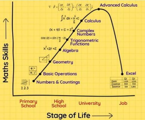
But, jokes aside, I think you see where I’m going. It’d be great to share our experiments and findings with people who’d be interested but don’t have a clue where to start with Jupyter Notebooks. Of course, you could use something like Power BI… but come on, did you really spend all that time learning Python just to end up back in Excel-land? 😂 I know a lot of people have faced that situation, as the meme below perfectly captures!

Over the past 5 years or so, there’s been a surge of Python visualization tools. I’ve tried a couple, like Dash and Streamlit. Personally, I like Dash more, which is why I’m putting together this tutorial. (And no, I’m not getting paid to say this! 😄) This isn’t an ad—just me sharing my experience and the ups and downs I’ve had using this framework.
Introduction
Taking the first step is always tough—especially when you’re staring at all those shiny graphs and battling the urge to make everything work right now. Trust me, I’m feeling the same way while writing this blog. But before jumping in (or more like, before taking the “zero step”—we’re computer scientists, after all), start by creating a GitHub repository. I’m assuming your goal is to build this project for more than just yourself or to add it to your resume, right?
For example, I wanted to make a tutorial that teaches the basics of time series prediction, so I put together a guide, which I definitely recommend checking out! I created a repository for it called sakura-time-series. Once you’ve got your repository set up (and if you’re not familiar with this whole “GitHub magic,” check out this tutorial), clone it so you have a local folder to work with.
Next up is setting up your virtual environment. I’ll stick to Python’s virtual environment for this guide, but if you’re more comfortable with conda, feel free to go with that!
python3 -m venv venvAfter running the command above, you’ll see a folder named venv, which holds everything for your virtual environment. To activate it, use source venv/bin/activate. Now that it’s up and running, it’s time to install the libraries you’ll need. I’ve listed a few general ones to get started, but feel free to add anything else you might want!
pip install pandas numpy matplotlib plotly dash dash_bootstrap_componentsInitially, I had a bunch of Python and Jupyter Notebook files filled with visualizations. But, as I mentioned earlier, I want to make these more accessible so that even non-programmers can check them out. With that goal in mind, let’s create our first Dash app. We’ll start by creating a file named app.py, and inside it, we’ll add some basic code to get a feel for how it works. Once we’re comfortable with the setup, we’ll dive into more advanced features!
from dash import Dash, html

app = Dash()

app.layout = [html.Div(children='Hello World')]

if __name__ == '__main__':
    app.run(debug=True)
To run our Dash app, we need to execute the file that has our app.run() method. Keep this in mind because as our project grows, things will get more complex and organized. For now, just run python app.py and then go to http://localhost:8050/ in your browser to see it in action! You should see a very simple “Hello World” message, just like the image below.

Understanding the Structure of the Dash Framework
Dash is a powerful Python framework specifically designed for creating interactive web applications. It’s built on top of Flask, Plotly, and React.js, making it an ideal tool for turning your data and visualizations into fully interactive, web-based dashboards.
The structure of a Dash app generally revolves around three main components:
- Layout: This is where you define the visual components of your app, such as buttons, sliders, dropdown menus, graphs, and other HTML elements. Each component is a building block of your app’s interface, organized in a hierarchical structure using Dash’s
htmlanddcc(Dash Core Components) modules. - Callbacks: Callbacks are the heart of Dash’s interactivity. They allow you to link user inputs (like selecting a dropdown option or clicking a button) to updates in your app’s layout or data. In other words, they handle the app’s dynamic behavior and make it responsive.
- Server Configuration: Dash apps use a Flask server under the hood, which means you can integrate the same server features such as routing, middleware, or authentication, if needed. This part typically involves initializing the app and using
app.run_server()to start it.
A typical Dash project usually has a structure like:
sakura-time-series/
│
├── app.py                # Main app file
├── assets/               # Contains CSS and JS files for styling
├── data/                 # Directory for datasets
└── components/           # (Optional) Additional components or pages
The app.py file is usually where the main logic goes. It will include the layout definition, any callbacks you want to add, and the code to run the server. As your project grows, you might want to split your code into separate modules for better organization, which we’ll do in a moment.
Now that we understand the basics of project organization, let’s set up our folder structure by creating the assets, data, and components directories. I’ll show you what files to add inside each folder to get started.
Since I’m working with a previous time series project, I already have the data files. If you want to use the same data, feel free to clone the sakura-time-series repository.
git clone [email protected]:igor17400/sakura-time-series.gitHere’s the recommended structure:
sakura-time-series/
│
├── README.md
├── requirements.txt
├── data/
│   ├── sakura_first_bloom_dates.csv
│   └── sakura_full_bloom_dates.csv
│
├── dash-app/                        # Directory for the Dash project
│   ├── app.py                       # Main Dash application file
│   ├── assets/                      # Contains custom CSS and JS files
│   │   └── style.css                # Example CSS file
│   ├── data/                        # Dash-specific data folder
│   │   └── dash_data.csv            # Placeholder for additional datasets
│   └── components/                  # Contains layout and callbacks
│       ├── layout.py                # Organizes the layout structure
│       └── callbacks.py             # Contains Dash callbacks
| .
| .
| .
|
|-- other folders...
In my case, having these directories makes sense, but feel free to organize your project in a way that suits you best. Just make sure to create a dedicated folder where all your Dash files will be grouped together, similar to my dash-app folder.
Folder Overview:
- dash-app/ – Main folder for all Dash-related files.
- dash-app/assets/ – Contains CSS and JavaScript files for styling and any additional custom behavior.
- dash-app/data/ – (Optional) Use this folder if you want to keep Dash-specific datasets separate from the main project data.
- dash-app/components/ – Useful for breaking down the app into separate layout and callback files for better organization.
Project Files
- Create
dash-app/assets/style.css- This file will hold custom CSS styles to make our visualization a bit more polished. Here’s a simple styling example:
body {
    font-family: 'Arial', sans-serif;
    background-color: #f5f5f5;
}

h1 {
    color: #FF69B4;
    text-align: center;
}

.graph-title {
    text-align: center;
    margin-top: 10px;
    color: #333;
}

.container {
    width: 80%;
    margin: auto;
}- Create
dash-app/components/layout.py- The
layout.pyfile defines the layout of our Dash app - Create a new file named
layout.pyinside thecomponentsfolder and add the following code:
- The
from dash import html, dcc
import pandas as pd
import plotly.express as px

# Load data from the CSV file
df = pd.read_csv('../../data/sakura_first_bloom_dates.csv')

# Convert the "First_Bloom" column to datetime
df['First_Bloom'] = pd.to_datetime(df['First_Bloom'] + " " + df['Year'].astype(str))

# Create a line chart using Plotly Express
fig = px.line(df, x='Year', y='First_Bloom', markers=True, title="Sakura First Bloom Dates in Kyoto")

# Define the layout of the app
def create_layout():
    return html.Div(
        className="container",
        children=[
            html.H1("Sakura Time Series Dashboard"),
            html.Div(
                className="graph-title",
                children=[
                    html.H2("First Bloom Dates for Sakura in Kyoto"),
                    dcc.Graph(
                        id='bloom-line-chart',
                        figure=fig
                    )
                ]
            )
        ]
)- Create
dash-app/components/callbacks.py- This file will be for any future interactive features. For now, we’ll keep it simple with a placeholder function:
def register_callbacks(app):
pass # This will hold callback functions for interactive elements later- Modify
dash-app/app.py- Finally, let’s modify our
app.pyfile to combine everything. Add the following code:
- Finally, let’s modify our
from dash import Dash
from components.layout import create_layout
from components.callbacks import register_callbacks

# Initialize the Dash app
app = Dash(__name__, assets_folder='assets')

# Set the layout for the app
app.layout = create_layout()

# Register callbacks (if any)
register_callbacks(app)

# Run the server
if __name__ == '__main__':
app.run_server(debug=True)- Run Your Dash App
- Once all files are in place, navigate to the
dash-appfolder and run:python app.py - Open your web browser and go to
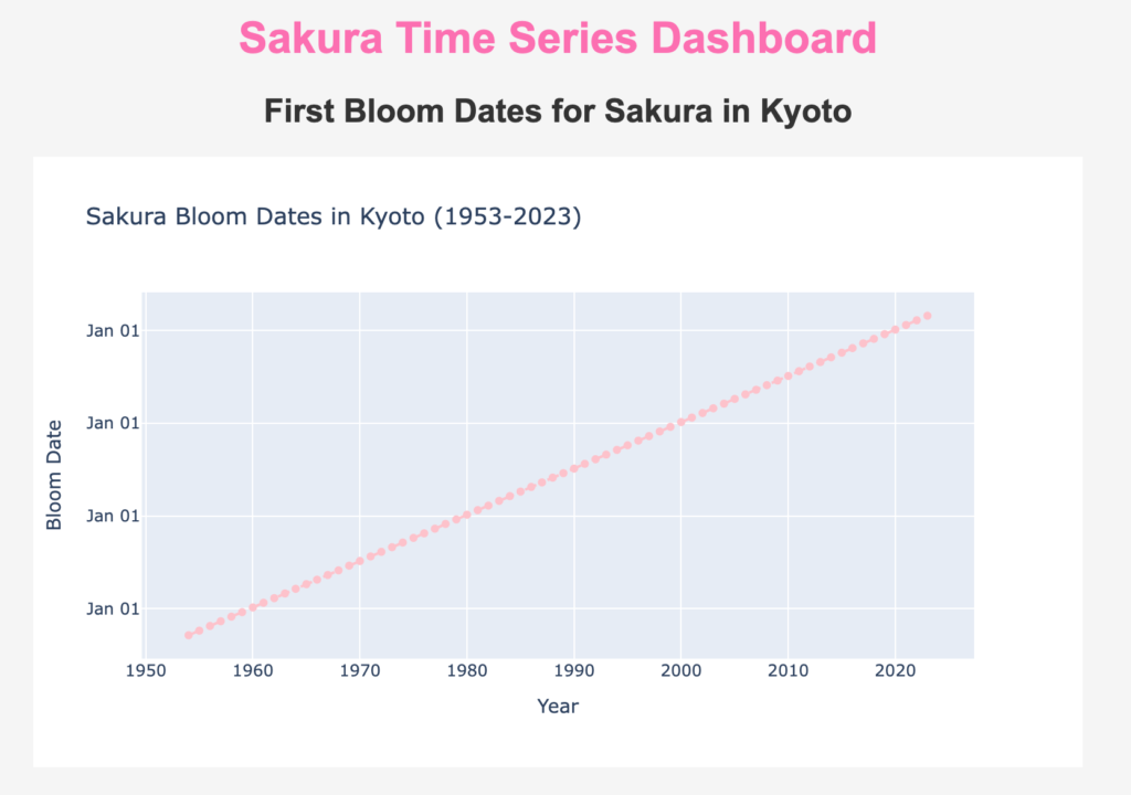
http://localhost:8050/. You should see a simple dashboard showing a line chart of Sakura bloom dates in Kyoto over the years.
- Once all files are in place, navigate to the
- Breakdown of the Code:
layout.py: This file creates the main layout of the app using Plotly’spx.linefor a time series visualization. It reads fromsakura_first_bloom_dates.csv, processes the date column, and plots a line chart.style.css: Provides a bit of styling to make the app visually appealing, changing font styles and adding margins for better spacing.app.py: Ties everything together by setting up the app layout and starting the server.
- Visual output
- Your dash app should display something similar to the image below

Creating interactive HTML components (Dropdown)
The real advantage of using Dash isn’t just about displaying static graphs—you could easily export your Jupyter Notebook to a PDF and share it if that’s all you need. The power of Dash lies in its ability to create complex, interactive processes that allow users to explore and customize visualizations dynamically.
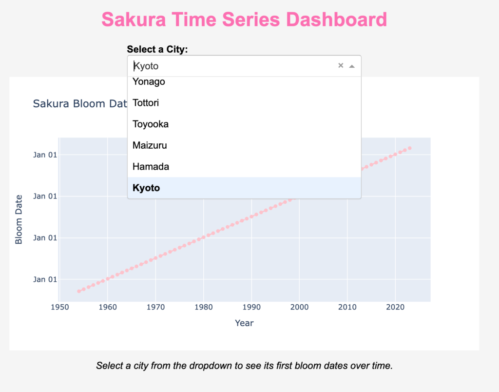
To showcase this interactivity, let’s start by adding a dropdown menu that enables users to select a Japanese city and view its corresponding first bloom dates over time.
Code Implementation:
- Modify the
layout.pyfile indash-app/components/:- Replace the previous content of
layout.pywith the following code to add a dropdown menu and interactive graph:
- Replace the previous content of
from dash import html, dcc
import pandas as pd
import plotly.graph_objs as go

# Load the Sakura bloom data
sakura_first_bloom = pd.read_csv('../data/sakura_first_bloom_dates.csv')

# Extract the list of unique cities
cities = sakura_first_bloom['Site Name'].unique()

# Define the layout for the Dash app
def create_layout():
    return html.Div(
        className="container",
        children=[
            html.H1("Sakura Time Series Dashboard"),
            html.Div([
                html.Label("Select a City:", style={'fontWeight': 'bold'}),
                dcc.Dropdown(
                    id='city-dropdown',
                    options=[{'label': city, 'value': city} for city in cities],
                    value='Kyoto'  # Default value
                ),
            ], style={'width': '50%', 'margin': 'auto'}),

            dcc.Graph(id='city-bloom-graph'),  # Placeholder for the dynamic graph

            html.P("Select a city from the dropdown to see its first bloom dates over time.",
                   style={'fontStyle': 'italic', 'textAlign': 'center'})
        ]
)- Add the interactive callbacks to
callbacks.py:- Modify the
callbacks.pyfile insidedash-app/components/to define how the dropdown selection changes the graph display:
- Modify the
from dash import Input, Output
import pandas as pd
import plotly.graph_objs as go

# Load the data again
sakura_first_bloom = pd.read_csv('../data/sakura_first_bloom_dates.csv')

# Register the callback function
def register_callbacks(app):
    @app.callback(
        Output('city-bloom-graph', 'figure'),
        Input('city-dropdown', 'value')
    )
    def update_graph(selected_city):
        # Filter data for the selected city
        years = sakura_first_bloom.columns[3:-2].astype(int)
        bloom_dates = pd.to_datetime(
            sakura_first_bloom.loc[sakura_first_bloom['Site Name'] == selected_city, years.astype(str)].iloc[0]
        )

        # Create scatter plot for the selected city
        fig = go.Figure()
        fig.add_trace(go.Scatter(
            x=years, y=bloom_dates, mode='markers+lines', marker=dict(color='pink'),
            line=dict(dash='dash'), name='Bloom Dates'
        ))

        fig.update_layout(
            title=f'Sakura Bloom Dates in {selected_city} (1953-2023)',
            xaxis_title='Year',
            yaxis_title='Bloom Date',
            yaxis=dict(tickformat='%b %d'),
            hovermode='closest'
        )
return fig- Update the
app.pyfile to connect the layout and callbacks:- Make sure
app.pyindash-app/looks like this:
- Make sure
from dash import Dash
from components.layout import create_layout
from components.callbacks import register_callbacks

# Initialize the Dash app
app = Dash(__name__, assets_folder='assets')

# Set the layout for the app
app.layout = create_layout()

# Register callbacks
register_callbacks(app)

# Run the server
if __name__ == '__main__':
    app.run_server(debug=True)
Breakdown of the Code:
layout.py:- Defines the layout, including the dropdown menu and a placeholder for the graph (
city-bloom-graph).
- Defines the layout, including the dropdown menu and a placeholder for the graph (
callbacks.py:- Defines a callback function that listens for changes in the dropdown menu and updates the graph accordingly.
app.py:- Initializes the Dash app, sets the layout, and connects the callbacks.
Once you run the app.py file, you should see a dashboard similar to the example image below. Keep in mind that the bloom patterns for certain cities might look quite similar, so try selecting cities like Kyoto and Naha to observe the differences more clearly.

A more in-depth review of callbacks
As previously stated callbacks are one of the most powerful features in Dash, enabling your application to become interactive and dynamic. By using callbacks, you can connect your app’s components—such as graphs, dropdowns, sliders, and buttons—so that changes in one component automatically update other components without requiring a page refresh.
How Callbacks Work
In Dash, a callback is essentially a function that is automatically triggered whenever the values of specified inputs change. The function then performs some operations (e.g., data filtering or visualization) and outputs the results to specified output components in your app.
Basic Structure of a Callback
A Dash callback typically follows this pattern:
@app.callback: This is a decorator that wraps around your callback function. It tells Dash that the wrapped function is a callback that will be triggered by the specified inputs.Output: Defines which component and property will be updated when the callback is triggered.Input: Specifies the components and properties that trigger the callback whenever their values change.update_function(input_value): This is the function that gets executed when the callback is triggered. The parameters passed to this function correspond to the values of the input components. It performs some processing and returns the output, which will update the specified component.
@app.callback(
    Output(component_id='output-id', component_property='property'),
    [Input(component_id='input-id', component_property='property')]
)
def update_function(input_value):
    # Perform some operations based on the input value
    result = some_processing(input_value)
    return result
Detailed Explanation of the Callback Components
- Input Component: The
dcc.Dropdowncomponent is defined with the IDcity-dropdown. It has a list of options (Kyoto, Naha), and the default value is set to ‘Kyoto’.- Component ID:
'city-dropdown' - Property:
'value'(the selected city)
- Component ID:
   dcc.Dropdown(
       id='city-dropdown',
       options=[{'label': city, 'value': city} for city in df['City'].unique()],
       value='Kyoto'
)- Output Component: The
dcc.Graphcomponent is defined with the IDbloom-graph. This is where the visualization will be displayed.- Component ID:
'bloom-graph' - Property:
'figure'(the figure to be displayed in the graph)
- Component ID:
dcc.Graph(id='city-bloom-graph')- The Callback Function: The callback function is defined using the
@app.callbackdecorator, which connects the dropdown’svalueto the graph’sfigure.- Input: The
selected_cityparameter receives the value from the dropdown (city-dropdown). - Processing: The function filters the DataFrame
sakura_first_bloomto get the bloom dates for the selected city. - Output: The filtered data is then used to create a line plot, and the resulting figure is returned to the
figureproperty of thecity-bloom-graphcomponent.
- Input: The
   @app.callback(
       Output('bloom-graph', 'figure'),
       [Input('city-dropdown', 'value')]
   )
   def update_graph(selected_city):
        # Filter data for the selected city
        years = sakura_first_bloom.columns[3:-2].astype(int)
        bloom_dates = pd.to_datetime(
            sakura_first_bloom.loc[
                sakura_first_bloom["Site Name"] == selected_city, years.astype(str)
            ].iloc[0]
        )

       # Create scatter plot for the selected city
        fig = go.Figure()
        fig.add_trace(
            go.Scatter(
                x=years,
                y=bloom_dates,
                mode="markers+lines",
                marker=dict(color="pink"),
                line=dict(dash="dash"),
                name="Bloom Dates",
            )
        )

        # Update figure layout
        fig.update_layout(
            title=f"Sakura Bloom Dates in {selected_city} (1953-2023)",
            xaxis_title="Year",
            yaxis_title="Bloom Date",
            yaxis=dict(tickformat="%b %d"),
            hovermode="closest",
        )
        return fig
       return fig
Multiple Inputs and Outputs
Dash callbacks can handle multiple inputs and outputs, making them highly flexible for complex interactions. For example:
@app.callback(
    [Output('graph1', 'figure'), Output('graph2', 'figure')],
    [Input('dropdown1', 'value'), Input('dropdown2', 'value')]
)
def update_graphs(dropdown1_value, dropdown2_value):
    # Use both dropdown values to create two separate graphs
    fig1 = some_function(dropdown1_value)
    fig2 = another_function(dropdown2_value)
    return fig1, fig2
In this example, changes in either dropdown1 or dropdown2 will trigger the update_graphs function, which updates both graph1 and graph2 simultaneously.
Chained Callbacks
Dash also supports chained callbacks, where the output of one callback serves as the input to another. This allows you to build highly interactive and multi-step workflows.
Limitations and Considerations
- Circular Dependencies: Dash does not allow circular dependencies between components (e.g., a callback’s output feeding back into its own input).
- Performance: Too many callbacks can slow down the app, so consider optimizing by minimizing the number of components linked.
- State: Use
StatealongsideInputto handle components that don’t directly trigger updates (e.g., to get the value of an input box without waiting for a submit button to be pressed).
Building Advanced Interactive Components for Our Dashboard
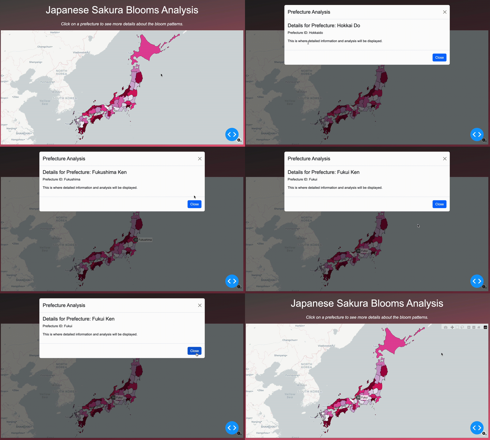
In this section, we will take our interactive dashboard to the next level by adding dynamic behavior to the map of Japan. Our objective is to plot each city from the dataset on a map, making each city clickable. When a user clicks on a city, a detailed analysis window (modal) will be triggered, displaying insights and visualizations specific to that location. This approach transforms a static map into a powerful exploratory tool, enabling users to delve into region-specific sakura bloom patterns and other meaningful data.
Key Features We Aim to Implement:
- Visualize the Dataset on a Map:
The foundation of our interactive map is a GeoJSON file that outlines Japanese prefecture boundaries. We’ll use this data to create aChoroplethmapboxusing the Plotly library, where each city or prefecture is distinctly colored based on its attributes. - Enable Clickable City Markers:
We’ll enhance interactivity by making each prefecture clickable. When a user selects a specific region, the dashboard will recognize the event and identify the chosen city. This functionality is achieved using Dash’scallbackmechanism, which listens for clicks and updates the display based on user interactions. - Display City-Specific Information:
Upon clicking a city, a modal window will pop up, presenting detailed information about that city, such as bloom dates, trends, and unique sakura bloom patterns. This modal will serve as a dedicated space for rich visualizations and text, providing a focused view of the city’s characteristics. - Ensure a Smooth User Experience:
The design should be intuitive and visually appealing. The map will occupy the majority of the screen, and the modal will be styled to complement the dashboard’s overall theme. Our goal is to create a seamless browsing experience that maintains clarity and avoids clutter.
Code Implementation and Explanations
Here’s a detailed look at how we achieve each of these behaviors, including the libraries used and how they interact to build our dashboard:
1. Using Plotly for Map Visualizations
- The
plotly.graph_objsmodule offers theChoroplethmapboxcomponent, which is ideal for representing geographic data on a map with region-based coloring. - GeoJSON: To visualize the boundaries and shapes of each prefecture, we use a
GeoJSONfile. AGeoJSONis a popular format for encoding a variety of geographic data structures, making it a perfect choice for outlining regions on a map.
import plotly.graph_objs as go
import json

# Load GeoJSON file for Japanese prefectures
geojson_path = "../data/japan_prefectures.geojson"
with open(geojson_path, "r") as f:
    japan_geojson = json.load(f)
In the above snippet, we load the GeoJSON file, which contains information on Japanese prefecture shapes. This data is used to define the map boundaries.
- Choropleth Map: A choropleth map shades regions based on a data variable, helping users visually compare different regions. Here’s how we set up a
Choroplethmapboxto color each prefecture based on unique values. - To download the file for the Japanese prefectures refer to the following link: https://www.kaggle.com/datasets/zhanhaoh/geographic-data-of-japan
# Create a sample DataFrame to assign a color value to each prefecture
prefecture_data = pd.DataFrame(
    {
        "id": [feature["id"] for feature in japan_geojson["features"]],  # Extract IDs from GeoJSON
        "value": range(len(japan_geojson["features"]))  # Assign a different value for each prefecture
    }
)

# Create the choropleth map using Plotly
map_fig = go.Figure(
    go.Choroplethmapbox(
        geojson=japan_geojson,
        locations=prefecture_data["id"],  # Match prefecture IDs to locations in the GeoJSON
        z=prefecture_data["value"],  # The values to use for coloring
        colorscale="PuRd",  # Choose a colorscale
        marker_line_width=0.5,  # Boundary line thickness
        marker_line_color="black",  # Boundary line color
        featureidkey="id",  # Match GeoJSON id field directly
        showscale=False,
    )
)
Here, each prefecture is uniquely colored using the "PuRd" color scale, making it easy for users to visually distinguish between regions.
2. Creating a Clickable Map with Dash Callbacks
- Callbacks: As we have explained before, a
callbackin Dash is a way to define interactivity. It uses a function that is triggered when an input changes (e.g., a user clicks on a map) and then updates a component of the dashboard (e.g., displaying a modal). Our input change now will be when the user clicks a prefecture of Japan.Input("japan-map", "clickData"): Monitors for click events on the map.Output("modal", "is_open"): Controls whether the modal is displayed.- When a city is clicked, the callback identifies the city ID (
prefecture_id) and uses it to update the modal’s content with city-specific information.
from dash import Input, Output, State, html

# Define the callback function to handle click events on the map
@app.callback(
    Output("modal", "is_open"),  # Control whether the modal is open
    Output("modal-content", "children"),  # Update modal content
    Input("japan-map", "clickData"),  # Listen for clicks on the map
    Input("close-modal", "n_clicks"),  # Listen for clicks on the modal close button
    State("modal", "is_open"),
)
def display_prefecture_info(clickData, n_clicks, is_open):
    # If a prefecture is clicked, extract its ID and display the modal
    if clickData:
        prefecture_id = clickData["points"][0]["location"]

        # Get the name of the clicked prefecture
        prefecture_name = prefecture_data[prefecture_data["id"] == prefecture_id].iloc[0]["name"]

        # Create content for the modal body
        modal_content = html.Div(
            [
                html.H4(f"Details for Prefecture: {prefecture_name}"),
                html.P(f"Prefecture ID: {prefecture_id}"),
                html.P("This is where detailed information and analysis will be displayed."),
            ]
        )

        return not is_open, modal_content

    # If the close button is clicked, close the modal
    if n_clicks:
        return not is_open, None

    return is_open, None
3. Creating a Custom Modal Window for Displaying City Information
- Dash Bootstrap Components (dbc):
dbc.Modalis a component from the Dash Bootstrap library used to create stylish pop-up windows. We define its header, body, and footer to present the detailed city data in a structured manner. - For more information on this library please refer to the following link: https://dash-bootstrap-components.opensource.faculty.ai/
dbc.Modal(
    [
        dbc.ModalHeader(dbc.ModalTitle("Prefecture Analysis")),
        dbc.ModalBody(id="modal-content"),  # The content updates dynamically
        dbc.ModalFooter(
            dbc.Button("Close", id="close-modal", className="ml-auto")
        ),
    ],
    id="modal",
    size="lg",
    is_open=False,  # Modal is closed by default
)
Why This Approach Works
This method ensures a streamlined and visually appealing user experience. Users can click on a city to see detailed insights without leaving the map, making the exploration of the sakura bloom data more interactive and intuitive.
By combining the power of Plotly, Dash, and GeoJSON, we’ve built a flexible and interactive tool that encourages users to explore regional data in a visually compelling way.

That’s it for now!
I hope this proves to be helpful to someone other than just me!
✧⁺⸜(^-^)⸝⁺✧
